News, Background, Press releases
Common visual identity with modernized logo – the post horn remains in place
For its 175th birthday, Swiss Post is getting a modernized logo: a single, shared logo for the whole of Swiss Post – including PostBus. What does this mean for PostBus in concrete terms? What’s new, what stays the same? And why are we doing this in the first place? Let us explain.
Rich Content Section

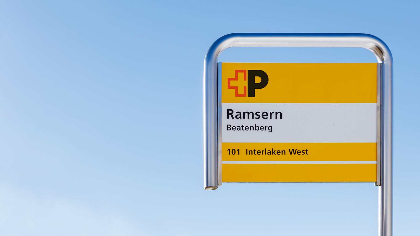
On 1 January 2024, Swiss Post will celebrate its 175th anniversary. To mark this special occasion and as part of the “Swiss Post of tomorrow” strategy, the company is modernizing its logo. In future, there will be just one common logo shared by Swiss Post and PostBus throughout the whole of Switzerland – an expression of all language regions, a unifying element and a symbol of a Swiss Post that is looking forward. Click here for the official press release from Swiss Post. This change will mean the end of the separate PostBus logo, which for 25 years adorned our vehicles, bus stops and garages in the four national languages.
Swiss Post’s commitment to mobility
With the “Swiss Post of tomorrow” strategy, Swiss Post is demonstrating its commitment to its activities in the mobility market and public transport. With Postbuses once again bearing the Swiss Post logo, they will give a visible sign of the developments of recent years and send a strong signal that mobility and, in turn, PostBus is an important and integral part of Swiss Post. As a reliable partner of many cantons and municipalities, a client of numerous subcontractors and an employer of staff with a passion for public transport, the hallmark of PostBus is its powerful range of public transport services. By adopting the new logo, PostBus is also moving closer to its parent company in visual terms, tying it to the first 150 years of Swiss Post’s existence.
Back to the roots
As some may still remember, in the 1920s, Swiss Post was merged with the telephone and telegraph service to form the PTT. Around 70 years later, the company was split up again, with Swiss Post and Swisscom operating independently of each other since 1998. The Swiss postal service then became known as “SWISS POST”. From that point on, the two other Group units, PostBus and PostFinance, also had their own multilingual market presence. The result: more than a dozen different logo variants for the various Swiss Post companies.

To mark this landmark anniversary for Swiss Post, the company is reflecting on its roots and giving itself a simple, strong and modern logo, which builds consciously on the strengths and attributes of the past. It represents Swiss Post’s ambition – connecting people and powering a modern Switzerland. At the same time, the Swiss Post and PostBus logos in four languages will make their exit, replaced by the modernized Swiss Post logo – as was the case in the first 150 years of Swiss Post.
The post horn stays
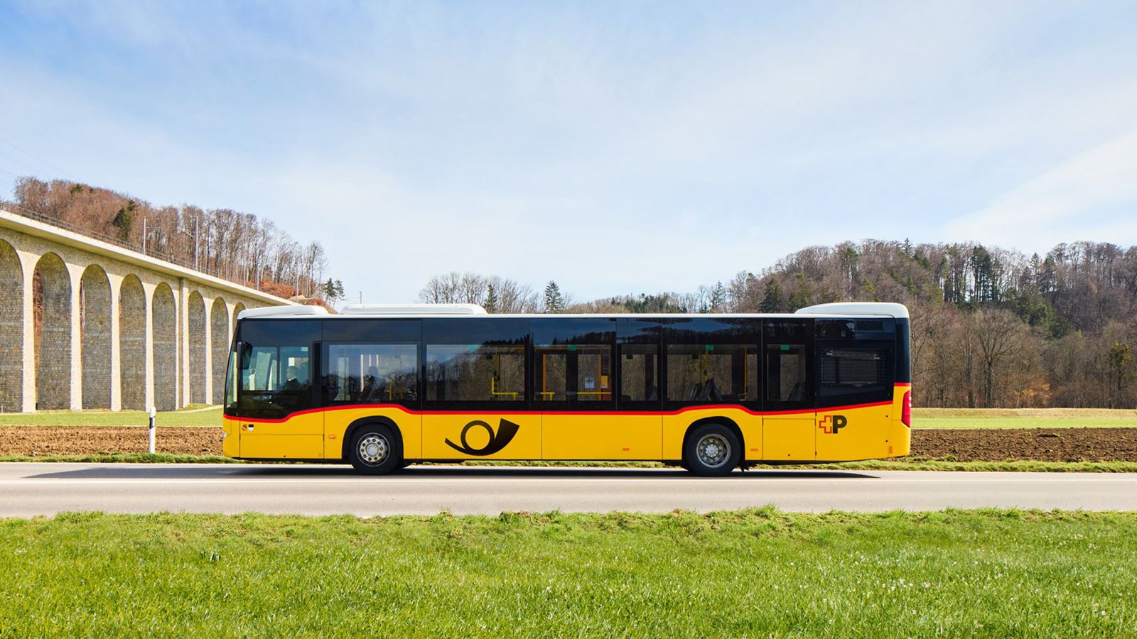
Together with the trademarked Swiss Post yellow colouring and the world-famous three-tone horn, the post horn is an unmistakable visual identifier of Switzerland’s largest bus company. So we want to reassure our many Postbus fans: the post horn will stay where it is! For our customers, our purchasers and all of its fans, the Postbus with its own colour, a sound that every child knows and an unmistakable visual appearance will keep its iconic status. The familiar symbol will continue to be clearly visible on more than 2,200 Postbuses in the future. The post horn will also continue to feature prominently on fan merchandise of all kinds.

Gradual implementation
Use of the modernized logo on our digital channels starts right away. The first Postbus with the new look should also be making its appearance on Swiss roads in just a few weeks. However, it will take several years before all vehicles, stops and building signage have been revamped, so you will come across both the old and modernized logos during the transition phase. The cost of replacing the logos will be borne by the Group as a whole and will be spread over a period of several years. In the medium and long term, the change will produce savings, as a simple, language-neutral logo can be much more efficiently managed than a logo with numerous variants.


